1 June 2015
Top tips on developing accessible mobile app

Internet and mobile computing bring much convenience to most people. However, some may have a wrong perception that persons with disabilities, especially those visually impaired, are unable to use mobile devices and mobile apps. Many mobile app developers are even not aware of the special needs of the disability groups in using mobile devices. In fact, more and more persons with disabilities are using touch screen devices nowadays. Mobile devices and apps enable them to use Information and Communications Technology (ICT) anytime and anywhere more effectively, live a more independent life and participate fully in the society. To start developing an accessible mobile app, here are some tips to the top 6 common accessibility pitfalls –
#1 Meaningful text alternative for non-text contents
Non-text contents including images, buttons, etc., in mobile app must have a meaningful and concise text description so that it can be read aloud by screen reader. Text alternatives should also be kept short (around 4-word long) as far as possible, to facilitate visually impaired persons using text-to-speech software and/or text-to-Braille hardware. Other practical tips include -
- Provide null or empty value for decorative images
- Ensure the text alternative is ended with “button” for function buttons (For standard UIKit button of iOS, the content is provided with “button” in the traits attribute by default. You can use Accessibility Inspector to check the traits that are set on the standard controls)
- Use same language for text alternative as the user interface language
- Pay attention to date format, e.g. 14th February 2015 is more meaningful than 2015.2.14
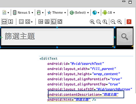
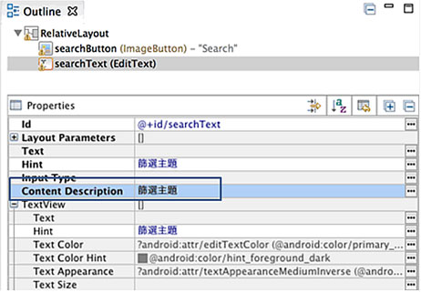
Android
Add the text alternative to Content Description in layout xml :
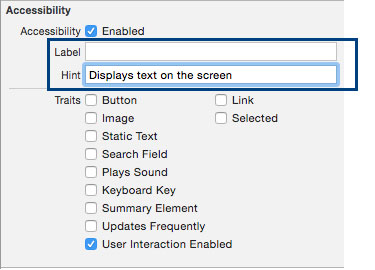
iOS
Add the text alternative by creating Labels. If the results of a user’s action on a control or view are not clearly implied by its label, create Hints which briefly describes the results of performing an action on a control or view.
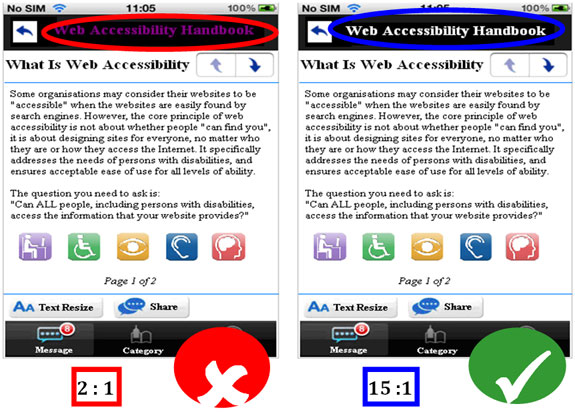
#2 Colour Contrast
Choose appropriate text and background colours so that they have a contrast ratio of at least 4.5 : 1 to make the text easy to read. When links are underlined (or otherwise differentiated) as well as colored, we should ensure that color blind users will be able to notice them.
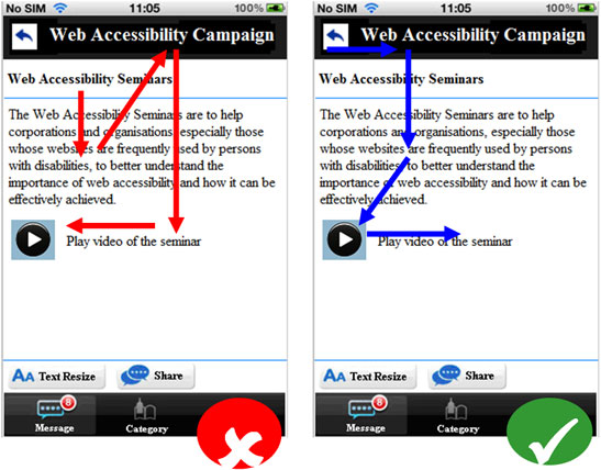
#3 Meaningful reading sequence
Having meaningful reading sequence is important for those who solely rely on screen reader to read app content. If the content needs to be read in a certain order, ensure the mobile app is designed and coded with the reading sequence ordered logically in order not to confuse the end user. Developers should pay more attention to special layouts such as tree control, data grid, and text area. It is highly recommended that developers and user acceptance test team spend time to learn how to use screen reader and its controls. Thorough testing using screen reader for accessibility should be conducted throughout the development process instead of scheduling it to the last.
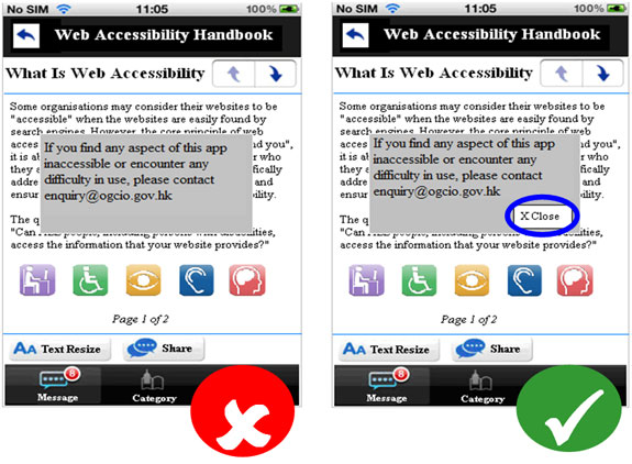
#4 Popover screen
Elements that pop out or fly out are undesirable to visually impaired persons to navigate. Popover commercial advertisement is one of the common elements that cause nuisance to users who can't see. Always provide means to close the popover.
#5 Size of clickable object
Tapping on mobile phones and tablets is not always an easy task for everyone, in particular, persons with visual impairment, the elderly and those with upper limb or hand mobility problem. When text and images are large and/or enlargeable, it is easier for users with poor eye sight to read and understand the content. Bigger sized buttons allow users to tap and operate the functions of a mobile app comfortably. In order to provide an optimal viewing and usage experience, the size of clickable objects should not be smaller than the device default icon size or operating system standards:
Android
9mm
iOS
44 x 44 points
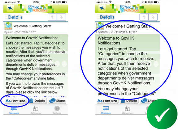
#6 Text Resize
Always provide text resize function to facilitate users with poor eye-sight. It will help persons with mild visual impairment read tidied content on the screen without a need to use screen magnifying gesture.