9.5 WCAG 2.1 Success Criterion 1.4.3 - Contrast (Minimum)
Design text and images so that they have a contrast ratio of at least 4.5:1 between the background and the foreground to make it easy to read.
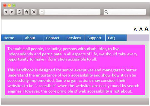
Before Rectification

In this example, the white text on the pink background has poor contrast, making it hard to read.
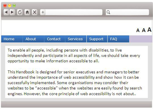
After Rectification

When higher contrast text is used, the text is much easier to read. There are colour contrast checkers available online that can assist web developers to check the contrast of their webpages.
WCAG 2.1 Reference:
https://www.w3.org/WAI/WCAG21/Understanding/contrast-minimum


